Friday, January 4, 2013

Gamification and Serious Games

As part of a Serious Games/Gamification course, I was directed to read/watch the following links in order to get a better idea of Serious Games and Gamification.  Below are summaries of the main points, and what I took away from the experience.

Meaningful Play: Getting Gamification Right
Sebastian Deterding

“I basically made a game out of it by deciding ok, I imagine there is lava and...I should not step on the little cracks in the pavement, which turned that very boring walk home less boring, and more exciting for me.”

User experience designer and game researcher, Sebastian Deterding, summarizes a few attractions of Gamification and discusses what's frequently missing from implementations. Long and dull tasks can be made more bearable by means of make-believe: creating interesting rules and challenges. Daunting tasks can be broken up into smaller sub-goals, which provide more frequent feedback, to make them less daunting. Providing an unobserved, unregulated space to play can lead users to learn and explore.
Deterding expands on these attractions, defining the aspects of Meaning, Mastery, and Autonomy (respectively) as areas of Gamification that are often overlooked. Goal-setting can be a driving force for user participation, as long as the goals are clearly defined, paced, layered, and varied. These goals are more desirable if there exists a community of users who share a similar interest. Adding storytelling elements can help add meaning to the user's goals and actions. The author reminds designers that play is voluntary, and users should be guided not forced to perform tasks. He also warns of some pitfalls such as gaming the system (emergent behavior), devaluing of service (offering sweepstakes for sign-up/participation), and creating social awkwardness.


Ian Bogost

“...Gamification is marketing bullshit, invented by consultants as a means to capture the wild, coveted beast that is videogames and to domesticate it for use in the grey, hopeless wasteland of big business, where bullshit already reigns anyway. “

Media Philosopher, Ian Bogost, addresses the over simplification of the of the video game allure into “Gamification”. Bogost uses the term 'bullshit' to demean the intelligence of corporate officers, who he claims treat Gamification as a trendy, buzz-word check-mark, right next to social media. He believes that, despite the critiques of players and game designers, Gamification continues to be reduced to “adding points”, a simple, repeatable process which instantly makes things better. Bogost offers the term “exploitationware”, as the term for the capitalization upon video games by sellers with “questionable expertise”.


Jane McGonigal

“...gamers are a human resource that we can use to do real-world work..”

Game designer, Jane McGonigal, pitches the idea of harnessing the average gamer's time, enthusiasm, and skills, on a global scale, to solve serious, real-world problems like world hunger and global warming. She identifies the feeling of constantly being on the verge of an “epic win” as the addictive quality of gaming. She also notes that the feeling of being “bad at life”, and the fear of failing drive people away from trying hard in the real-world. McGonigal cites Malcolm Gladwell's 10,000 hour rule (that spending 10,000 hours on a single task will result in mastery of the task), and the fact that today's average child will spend 10,000 hours gaming by the time they turn 21, as the advent of a generation of “virtuoso gamers”. She provides historical precedence by telling the story of the kingdom of Lydia, who's ruler stifled civil unrest amidst a twenty-year famine, by ordering citizens to play games to distract them from their hunger.


Tadhg Kelly

“ It only works if you reduce your objectives to the improvements of one quantity that players can influence and one kind of emotion sitting behind that. “

Game Designer, Tadhg Kelly, provides a set of guidelines for Gamification, three different “kinds” of Gamification, and discuses the mindset required to implement Gamification. Kelly suggests that designers create a numeric representation of success, but warns that this number must be meaningful, and not overly complicated. A game should be simple enough that it can be summarized in one sentence. Kelly notes that users need direct feedback and that they like immediate gratification/rewards. Kelly notes that following pedestrian mechanics (badges, levels, and experience points) can be boring. Moreover, he states that mimicking another game too closely will simply breed contempt from users. Kelly identifies three drives that keep users playing: validation, completion, and prizes. Validation is provided to users in the form of increased popularity, social approval, and community forming. The feeling of Completion rewards users for putting forth substantial personal effort, and serves as an intrinsic motivator. Prizes (extrinsic) can be useful as they drive users to participate, but users will only play as long as there's a carrot in-front of them.


The Game is a Lie.
After going through the above resources, I can't help but feel like the difference between Gamification and Serious Games is in the implementation details, but that neither should include the word “game”. If one were to take a serious website, and apply Gamification, it might be called a Serious Game. At the same time, a Serious Game that wasn't designed very well might be viewed as something that was Gamified.

I want to believe that Gamification is bad. It sounds bad. It sounds lame. It sounds to me like a shallow copy of badly implemented video game mechanics. I watch as Deterding pull up sites like tumblr and Stack Overflow, and think to myself “these aren't games, serious games must be better”. They aren't. I cringe as I hear McGonigal say that one of her games wants users to imagine a scenario, and blog about it. This is homework, not a game. While some games may require “creative thinking”, no successful video game ever required writing. I am a gamer, and I am lazy. I will solve puzzles, complete quests, and kill indiscriminately. I will not blog to play a game. These examples are not “games”, what's really meant by “game” is “motivation”. Not the same.

I believe Serious Games can be both entertaining and solve serious, real-world problems (See Foldit and freerice.com). I also believe that Gamification can make things less mundane (maybe even “fun”). However, I don't think either of these two ideas will ever fully match the addictiveness and entertainment value of a true, triple-A rated video game.

Tuesday, April 24, 2012

The Grid

As the semester draws to an end, so too does this project.  PM gave us notice that this would be the last week we work on our sites.  I'm a little sad to see it be over, there have been some really neat ideas, awesome designs, and creative solutions.  It was fun to see what everyone else was doing from week to week.  Plus, have multiple people working on the same problem made the project a whole lot less stressful.  It took away a lot of the burden and mediocrity of what otherwise would have been a belly flop into a sea of endless divs . 

My goals for the last week were to finish cleaning up the site (the energy, prizes, & activities pages).  I also wanted to integrate Elton's Epic Grid.  I'll simply point to Elton's blog, and leave it up to the reader to educate themselves.  Elton's Grid is pretty slick.  At the last meeting, Elton pulls out his phone, brings up his Grid, and the group is wowed.  He pulled it off.  He made a hulking 9X12 interactive grid fit on a mobile screen. 

So of course I had to beat him... of course.  But the fact is, I can't.  Elton did a bang up job, the only small thing I could add was to fix a small issue where the title boxes for each row overflowed.  I did so by rotating the titles sideways, and elongating the divs.  The result is that the gird fits nicely on a 290px wide screen, which is just about any phone screen in portrait mode. 

Desktop View
Mobile view


Tuesday, April 17, 2012

Back to Square One

So after a pair of meetings on Friday, the PM lays out the following requirements for the Homepage:
1.  It should be in a list (and wrap freely)
2.  Elements should always be centered.
3.  By default, 3 elements per row.
4.  Flexible enough for 6-8 elements.
5.  It should be responsive.

The list seems simple enough, but in reality, items 1 and 5 are contradictory.

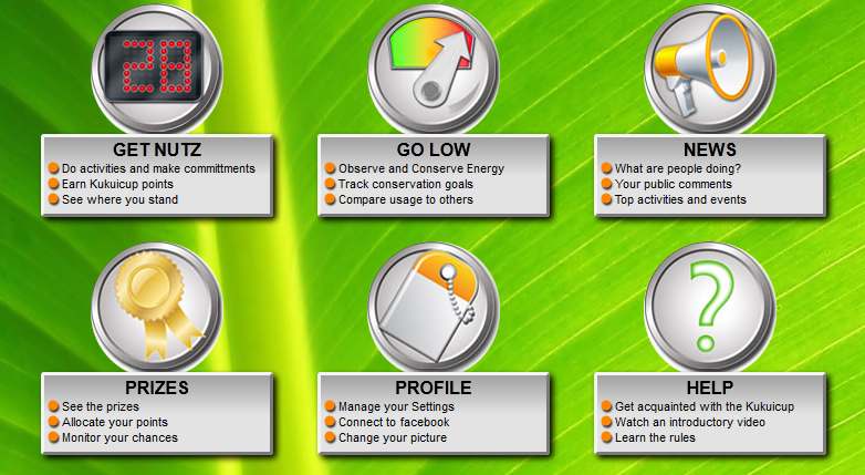
The original homepage had two rows of three elements (there were only 6 elements at the time), which were responsive, but overflowed their rows.  The result was that each row of three elements rendered as two elements pushed to the left, and one lone element wrapped on the next line.

My fix for this was to throw all the elements in a list, so that they wrapped freely, maximizing the number of elements in a row.  But this caused difficulties in centering elements.

The (lame) solution was to simply fix the over-flow problem, and have two rows of responsive elements.  However this looks strange on a very wide monitor, as you have three super long elements in each row.

The ultimate solution would probably to use jQuery or MVC-templating to dynamically determine how many elements to put in each row based on the screen size, and handle margins accordingly.  However, I felt like the PM might view this as "hackish" or too time-consuming, and so avoided it.

The Latest Build

Mobile view
Anyway, back to the meeting.  The PM tells us to ignore the larger screens for the moment, and try to get something that works well at a width of 1050px (his laptop resolution) and lower.  My latest bid goes back to square one: fixing the responsive rows to keep them from overflowing.  I did however integrate the multi-column mobile view from last week. 


A cool trick that I picked up this week was the use CSS selectors

:nth-child({ number expression | odd | even })

and
:nth-of-type({ number expression | odd | even })

I'll direct you here for a more detailed explanation and some nice samples:
http://css-tricks.com/the-difference-between-nth-child-and-nth-of-type/

But essentially they let you (in CSS) select elements of a parent using values and expressions.  Notably, they let you select every other, every third, or every nth element.  In my case, I used them to select the seventh element and give it a margin-left: 20%.  This essentially centers the last row of elements.  Neat right?

Link to the file in question:
http://kukuicup-rui.googlecode.com/svn/trunk/Bloggable/4-17-2012/home.html

and the CSS file:
http://kukuicup-rui.googlecode.com/svn/trunk/Bloggable/4-17-2012/css/home.css

Friday, April 6, 2012

Sometimes the Best kind of Responsiveness is no Responsiveness

After playing around with the HTML, and exploring Twitter Bootstrap's CSS, I've finally found the difference between class="row-fluid" and class="row".  Both containers scale with the page size, but row-fluid will also scale the components within that fluid row.  A plain row will keep the items a static size, and wrap them when there's not enough room.  After this week, I can appreciate having both options. 
  When doing my news page, I had the choice of either letting my elements flow and wrap as the page re-sized by using rows or making them stay put simply scale using row-fluid.  I would have opted for the standard row, but there's still a little bit of glitchyness caused by the overrides to the Bootstrap codebase made by senior developers.  So I ended up going with the fluid rows to keep things from hopping around excessively.


  Speaking of trouble with jumping elements, I had an issue in my homepage.  The homepage normally features several large icons-links with accompanying text.  Originally these icons were centered above the text, but I felt that this took up too much room, and so pushed the images inline with the text, and pushed them over a static number of pixels. 


This caused chaos when the divs were re-sized, images and text boxes went flying ever which way.  To rectify this, I had to make sure that the divs stayed a static width.  This effectively meant I couldn't use Bootstrap's built in responsiveness (but that didn't prevent me from trying for several hours).  Anyway, after a hard-fought but pointless battle, I realized I had a simmiliar issue weeks before.  The news page features a widget called "Lounge Members" which is made up of a div containing imagelinks that don't scale, and arrange themselves to fit within a scaling div.  Bingo.  After looking through the source, it turned out that the widget was an unordered-list (<ul>), with each imagelink being a list item (<li>).  To fix my homepage, I did the following:
<div class="dynamicallyResizingDiv">
    <ul>
          <li>
              <imageicon goes here>
          </li>
         <li>
              <imageicon goes here>
         </li>
        ....
   </ul>
</div>
 Of course I messed around with the margins on the li elements to make things look pretty.  And now that's sorted.


links:
news page: http://kukuicup-rui.googlecode.com/svn/trunk/Bloggable/news.html
home page: http://kukuicup-rui.googlecode.com/svn/trunk/Bloggable/home.html

Friday, March 23, 2012

BootStrap Take-2

So after playing around with bootstrap for the past week, I've come to the conclusion that it's pretty smart.  I mentioned last week a potential problem regarding the arrangement of divs of varying heights.  Well, it was a non-problem, I just threw the divs in question into another div and gave that div a span6 class (which makes that div dynamic).  I also gave a row three span6 divs (the sum of spans in a row should not exceed 12), and it handled them nicely, aligning two on the same row, and throwing the third to the next row, left justified.  The biggest challenge in this project is that the senior development team overwrote the auto-sizing/dynamic placements with media queries so that the navbar and infobar (the two strange looking bars) would span the entire width of the page.  This means that I have to handle my own margins, and that some of the custom-defined scaling parameters cause bad/awkward placements at some browser widths.  I've been trying to deal with these oddities on a case-by-case basis, but I've ended up writing a long series of media queries for very small,specific ranges of width.  Not very dynamic at all.  I think the solution in this case is to ditch the screen-spanning nav and info bars (plus the overridden CSS), and maybe use a hero-unit (one of BootStrap's features) instead. 

"A difference that makes no difference is no difference".
At the last meeting, I had a discussion about using rows vs fluid rows (class="row-fluid") .  It was advised that I use fluid rows, but from what I've seen so far, the difference is negligible.   This might stem from the fact that some of the CSS was overridden. It may end up being of some significance down the line, but I'll deal with it when I get there.  In the mean time, I can't complain about the performance of standard rows.

LESS is GREAT!
Last entry, I griped about how it had to be compiled, but honestly, it isn't that bad.  But after getting to play around with it, I found that "LESS-ifying" my CSS files was a simple matter.

<link rel="stylesheet/less" type="text/css" href="your-theme.less">
<script src="less-1.3.0.min.js" type="text/javascript"></script>

The above snippet is all that's needed to "compile on the fly".  Essentially there's a .js file that compiles the .less file on demand.  Pretty nifty.  My biggest fear was having to compile a LESS file every time I made changes, but this approach is just wonderful :).  For performance, once the LESS file is perfected, it can be compiled to a straight CSS file for faster page loads.
 
Here's the link to the .js file: http://lesscss.googlecode.com/files/less-1.3.0.min.js

Friday, March 16, 2012

Twitter Bootstrap & Dynamic CSS

BootStrap
This past week I took a look at BootStrap, Twitter's New(ish) RUI Framework.  Overall, I'm fairly satisfied with what I see.  Bootstraps similar enough to other RUI frameworks (like Skeleton, SimpleGrid, etc.) that it's easy to get into if you have prior experience, but offers a bunny-hill of a learning curve even if you haven't.  Being grid-based, it offers the usual flexibility of defining dimensions based on columns (the responsive grid offers 12 columns in a 960-pixel page), or fractions (one-third, one-fourth, etc).  It also offers basic alignment and in-lining class definitions, but nothing really special. 

 Aesthetically, BootStrap's default theme is very clean, with a color pallete of white, soft-greys, and bright blue accents.  This makes it great for quick mockups that still look professional.  Of course, these can all be overridden, and when combined with BootStrap's compliment of well-drawn icons, makes for a nice "grab-n-go" package.

Where BootStrap really comes into it's own is in it's Responsive package.  The elements scale very nicely, down to a certain point before jumping into a mobile-friendly, wikipedia-style format.  I also appreciate how navigation links collapse into a drop-down menu for easy access that doesn't take up a lot of screen space. 

The PM linked our group a nice little tutorial:
http://webdesign.tutsplus.com/series/twitter-bootstrap-101/

With respect to the Kukuicup site, it seems like moving to BootStrap would be fairly straight forward.  (Note I didn't say easy)  I'm thinking that the "widgets" can be migrated into the gird fairly easily.  The only obstacle I can foresee is that the widgets are different heights, and BootStrap probably wants divs to be the same height.  This might cause issues where the left side of a page is one long widget, but the right side has two shorter ones.  This might be overcome by using negative spacing to "stack" the two shorter divs on top of each-other.


LESS (and it's peers, SASS & CoffeScript)
The PM also raised concerns over the high-levels of repetition within the Kukuicup CSS files, and suggested LESS as a solution.  LESS is a Dynamic CSS language that lets you create methods and variables for CSS files.  For example, one could define a variable
@primarycolor: #FFF; 
and reference primarycolor anywhere in the CSS.  Additionally, LESS allows users to apply classes to other classes by adding the .class notation into another class definition.  For example, I define .shadow to have a drop shadow, I can add that shadow effect to a .box class by
.box {
      .shadow
}

Finally, LESS supports paramaterized methods, for example, letting you dump
     //radius defaults to 5px
.rounded-corners (@radius: 5px) {
      border-radius: @radius; 
}

#header {
      .rounded-corners(10px);
}

The downside to all this is that it requires compiling.  In a world where scripting languages run the web, this seems a bit odd. 


Friday, February 24, 2012

Kukuicup Design - pt III

This past weekend, the PM responded to my submission, and that both have "potential".  Additionally, he posted a laundry list of improvements to make to all of our sites.  The most notable item was that none of us had really touched the info, nav, and quest-bars.  I had been under the assumption that we weren't supposed to touch these.  Moreover, I had actively chosen to leave the quest-bar in theme-2 black. 

In our last meeting, the PM elaborated on his list of grievances, and noted discontinuities in shadows, rounded/square corners, and color palettes for the aforementioned bars.  So I spent this past week trying to revamp these elements.  Initially I tried using an image manipulation program to modify the existing images, but found it EXTREMELY difficult to get the radial widths (despite knowing their values) of my rounded corners to match with those generated by the webpage's CSS.  After a while I realized this approach was a dead-end and ditched it.  My next (and only other obvious) avenue of attack was by manipulating the images/divs with HTML/CSS.  As it turns out, this works really well. 

I ditched the actual image, instead compressing the containing div, and using a combination of padding and margins to keep things in their proper place.  In the illustration, the blue area is the actual div that contains the area highlighted in yellow.  Naurally, shrinking a div of this size down creates layout problems.  I was able to overcome this by adding a small top margin and a giant bottom margin (margins are shown as the yellow area).  This keeps elements in their proper place, while allowing me to use the encompassing div as a useful background for my nav and info bars.  The rationale behind this whole song and dance is  that I can't actually mess around with the html files, as they have to be the same for every theme.  So I had to use CSS to mess around with existing divs.

I also found that I was able to make transparent gradients using the rgba() method.  For example:
    background-image: -moz-linear-gradient(100% 30% 90deg, rgba(239, 214, 120,.67), rgba(255, 255, 255,.67));
    background-image: -webkit-gradient(linear, 0% 0%, 0% 50%, from rgba(255, 255, 255,.67), to rgba(239, 214, 120,.67));
the above two lines normally define a gradient, but by using the rgba method, I was able to set an alpha transparency, and make them transparent.  Neat trick.  The only caveat is that you have to convert color codes from Hex to Decimal.

I present, the finished product:

Friday, February 17, 2012

Kukuicup Design - pt II

So last week's meeting went pretty much as expected - the PM tells me my theme is "too gloomy" and reminds him of vampires.  Additionally, the PM agreed that there was "too much stuff" in the theme.css file, and instructed the groups to make a separate "style.css" file to contain all the non-theme related items (e.g. items needed to override/negate previously defined elements).  A discussion took place about not meeting as often.  The PM said he didn't like the idea and felt that frequent meetings (and thereby feedback) were important to the rapid prototyping methodology.  Interestingly enough, all our meetings this week were cancelled. 

I spent this week pulling extraneous elements out of theme.css and migrating them into style.css.  To the top of my theme.css file I added:
@import url('style.css');

I later discovered that issues arose when I sometimes removed elements from theme.css which were not defined by syle.css.  This resulted in certain elements having their settings defaulted to whatever was defined by the original kukuicup theme.  To resolve the issue, I essentially copied whatever css items were necessary to make the page (including both theme and style elements) into style.css, and then re-defined the same item in theme.css.  This lets theme.css have first-priority over what an element looks like, but if I accidentally (or lazily) fail to define a property of an element, style.css will still render it.  This occurs because I have the above nifty little import statement at the top of my theme.css page.

Another issue was that sometimes I wanted to change what was in the style.css file, but style.css was used by more than just one theme.  This made making style changes nearly impossible.  The answer was to have a separate style.css file for each theme.  While this is sub-optimal, it gives me the greatest flexibility over design options.

Anyway, to break up this giant wall of text, I'll show off a couple of the themes that I worked on this week.

"Theme-2"
Aiming for a "less gloomy", vampire-free theme.


"Theme-4"
We later got an email from the PM instructing us to createa "clean" white-based theme


If you're wondering what happened to "theme-3", trust me, your better off not knowing...

Friday, February 10, 2012

CSS Refactoring

So I spent the better part of the week reworking the CSS files for Makahiki.  As mentioned last week, the PM wanted us to factor out all of the relevant portions of CSS that affect the theme of the site.  The catch is that the files have to be able to support the old version of the site, as well as our newly proposed theme.  This doesn't leave a lot of room for design.

I got it done, but I'm not happy with the way the theme turned out (too many restrictions to realize my vision).  I'm also a bit hesitant to present the CSS file (theme.css in the SVN repository), as I feel that there's just too much stuff in it.  There were a bunch of specifically named divs that had custom properties that I had no choice but to include in the CSS file in order to overwrite their style.  Everything in the CSS file is necessary, but it's way too verbose.  I have a nagging feeling that there's a better way to do it.  I was looking at LESS and SASS, but had a feeling the PM wouldn't be too happy about that.  LESS and SASS provide the ability to template CSS files, and replace color/style references elegantly.  They do however have to be compiled.

From a design point of view, I feel like I could have made the site more vibrant and given it a higher contrast, however, this would have broken the "no dark backgrounds" rule.  I initially had some nice gradients, and transparencies, which provided enough contrast to pull off a color scheme that was heavily focused on shades of grey.  Unfortunately, some of the darker portions of the background and certain content boxes became too dark to pass the before mentioned rule.  I still have the dark theme floating around in my subversion files, and hopefully I can work it into a presentable product, but for now I'm submitting the lighter, lower contrast theme.

link to project:
http://code.google.com/p/kukuicup-rui/source/browse/#svn%2Ftrunk%2FCSS-Refactor

Saturday, February 4, 2012

Kukuicup Design

I'm taking a step back this week from tinkering with the RUI code in order to make the site "pretty".

Last Friday, the PM(Project Manager) tasked the group with redesigning the Kukuicup website. 
Let me rephrase that - Last Friday, the PM  asked a group of twenty-something year-old CS-majors to redesign a website...


What happens when you ask a group of twenty-something year-old CS-majors to redesign a website?  You get Matrix-themed websites. 

The PM was not amused. 

To be fair, there was only one Matrix-themed website, but we were all thinking about it. 

The following Tuesday, we had a rapid-prototyping session, where we presented our ideas, and were given immediate feedback.  The PM pointed out that large amounts of time and money had been poured into the HCI aspects of the site, and that we weren't improving on that temporal/monetary investment.  As a result, we were instructed to simply change the "theme" or "look and feel" of the website rather than mess with any of the layout or display elements. It was also dictated that there be no "dark" backgrounds.

Later in the week, we were told to modify a few CSS files to pull out the snippets of CSS that controlled the look/theme for elements so that they might be more easily modified.

My initial idea for the Tuesday presentation was to go with the PM's desire (and numerous related e-mails) for a brightly colored "gamey" theme.  Since the Kukuicup will potentially be used by institutions other than UHM(University of Hawaii at Manoa), I had to have a relatively generic design.  However, I still wanted to incorporate the idea of team/school colors.  My solution was to have a generic Kukuicup banner with bright "gamey" team colors thrown in as accents. 

*Note the banner shown to the right is not the one I had wanted to use, but the one I was forced to use as I didn't have access to the $100 required to purchase the not-to-be-named program, required to open the desired file.


After the criminalization of "dark" backgrounds, I decided to go with a mid-toned grey with black stripes thrown in to break up the monotony.  I also followed one of the suggestions the PM directed at me and added a ghosted-logo.  I would have liked the image to be darker, but was worried that the PM might prosecute me for my repeated transgression.  I also tried adding the brightly-colored accents back in, but they just didn't seem to 'fit' anymore. 


The current mockup:


And mobile...

Friday, January 27, 2012

Kukuicup Responsive UI - Part I

For the past few months I've been working on developing a mobile layout for the Kukuicup, an energy conservation project at the University of Hawaii at Manoa.  The mobile version of the site sported a series of list-like menus (similar to the Yelp application), but user comments at the end of the competition said the mobile site was too different from the desktop site, and therefore confusing. 

Enter Responsive UI (RUI). 

Essentially, RUIs are webpages that re-arrange (or replace) content based on screen size.  The canonical example our group has been throwing around is the BostonGlobe's website (try re-sizing your browser window from wide to skinny).  The goal of creating a RUI is to have one dynamic webpage for any screen size, and hopefully giving users a sense of continuity and uniformity.

You're probably thinking to yourself "this sounds like black-magic".  Well, you're right.  But you don't have to deal with it (much).  There are a slew of prepackaged frameworks out there designed to do just such sorcery.  There seem to be two schools of thought on RUI frameworks - grids and magic hot-swappable CSS.  Grids are pretty much what they sound like, predefined grids that either scale or have a few fixed layouts.  With grids, content gets pinned to a row/column, and flows around as the screen re-sizes.  With CSS magic, media queries are used and load various CSS files based on screen size.  Essentially you build several CSS files and the media query figures out the screen size and points to the right file (in real time).   These methods are completely integrable, but frameworks usually swing one way or the other.

I've chosen Skeleton.js for this project, and so far it's working pretty well.  Skeleton favors the grid-system, rocking class tags for up to sixteen columns.  Skeleton also features a nice in-line labeling system:

<div id="a" class="two columns alpha">A</div> 
<div id="b" class="four columns omega">B</div>
The above divs will try to render on the same line if possible, with A preceding B. When space becomes limited, B will pop under A.  This is a nice feature that I didn't see in most other frameworks, and was a motivating factor in my decision.

I've been toying around with it, and find simply relying on the framework to do ALL the re-arranging isn't going to cut it.  So I've integrated some media queries to make things run more smoothly.  Media queries are part of HTML5 and part of the CSS3 standard.  They work in both HTML and CSS files, although each has its own syntax.  For example, in HTML:

<link rel="stylesheet" type="text/css" href="a.css" media="screen and (min-width:975px)">
 The above code loads the file a.css if the screen size is at least 975px.  However, placement is still important, as CSS files loaded farther down in code have priority.

In CSS, a media query looks like this:
 @media only screen and (max-width: 924px) and (min-width: 438px){
    #className {
        //new CSS definition
   }
}
This snippet will provide an alternate CSS definition for className IF the screen size is between 924 and 483 pixels.
Again, placement within the code matters as later definitions take priority.

Hopefully Skeleton, paired with media queries, will be enough to produce an elegant webpage. 
Details as they unfold.

Tuesday, February 8, 2011

API Development

If you think about it abstractly enough, Lego has one of the most powerful APIs in existence (Yes, I'm really using Legos as a segway into API design...).  Simple and elegant, anything with those iconic plastic nubs will connect to anything else with the same plastic nubs.  The only restriction? No diagonals.  Of course there's various extensions and spin-offs, but at it's core, lies a simple system of nubs and circles.  This simple system allows users to manifest almost any physical construct that gravity and static-friction will allow.


I've spent the past week and a half working with a group to design the API for a energy efficient house (Solar Decathlon).  Basically we had to figure out how to shuttle data between Sensors, Actuators, the back-end Database, and of course the user.  I wanted our API design to be like Lego bricks.  Ideally, it would be simple but powerful, just a few abstract classes and interfaces that let the user decide how to handle their data.  So I went off and wrote up the divine code.  Then my team informed me that my design used too much energy.  Crap.  A long afternoon spent at a round-table in the library found us quibbling over energy, extensibility, and a few other point-less grains of sand.  Eventually we settled on a very static and manual approach that saved a few watts. 


One area of interest worth expanding on is the method of data transfer.  It should be realized that passing everything around as a String is not the best idea.  After all, you'd have to spend time parsing data out.  Java objects might be a nice compromise, except they tend to take up a lot of memory, and still have an associated Class type.  XML is my new go-to-guy.  Storing a Document in a database is like saying there's molecules in my house, they could be anything.  Documents are nice and generic, and support OOP designs.  They enable a single-typed database that actually stores a range of different object types.  Our API relies heavily upon the mysterious, but generic XML Document.  Processes know how to access their designated Documents, and only their designated Documents.  Thus, processes are the only thing responsible for knowing how to handle the Document's internal format.  This helps to promote encapsulation, extensibility and information hiding.


...And now,I humbly offer these low-hanging fruits of wisdom regarding API design:

1.  Figure out what's important.  
  Will energy savings trump extensibility and elegance of design?  Is simplicity the better part of valor?  Odds are you'll have to take one aspect at the cost of another.  Figure it out before you start.  It'll save you a long afternoon of face-palming.
2.  Make sure the design is at least as extensible as it needs to be.
  We made concessions in our extensibility because there's only so many sensors that a house can have (plus were on a budget).  But make sure its flexible enough to grow.
3. Trace transactions from end to end.
We scrapped several ideas only after coding them, and then realizing they didn't work.  Make sure the functionality is there.
4.  "When in doubt, leave it out"
What does it mean? Who knows.  But if you can find an applicable context, apply it! 
5.  Don't tell them how you did it.
A wise man once told me  (I saw it on a Google Video) that users should never know exactly how a method does what it does, or else they may come to rely on it's process rather than it's result.  For example, if you tell users how a hash value is calculated, they may use the hash function else where.  If you ever change the hash function, you break their code.

Saturday, January 29, 2011

BerkeleyDB

This week's assignment focused on bringing everything together into one monster webservice.  The build requirements called for a Wicket Client which accessed a RESTful Restlet server, which stored data in a BerkeleyDB database.  Basically, a nice web-based GUI that pulled data from a Server that stored stuff in a Database; a Turducken if you will. 

Recursively-stuffed fowl aside, the focus of this week was on Persistency (read: saving stuff).  Prior to this, my only method of storing data was in a Property Map, or Static Class, which unfortunately didn't stick around after execution  <insert guillotine joke here>.  The answer of course is to put things in a database. 

BerkeleyDB (BDB) is a neat little database service that runs in Java and a myriad of other languages (but most importantly, Java).  Having worked with DBs and webservices before, let me tell you, this thing rocks.  Set up is a breeze, and BDB is pretty darn flexible.  The best part?

NO CONNECTION STRINGS.

In this exercise, I had Contact objects which had unique IDs as primary keys.  All I had to do to was throw a @PrimaryKey attribute above the uniqueID attribute in the Contact class, and BDB associated it as the PrimaryKey.  Then, in the ContactDAO Class, a few lines of code let me define a "mini-DB" object, which let me call out mini-DB.get(key), mini-DB.delete(key), etc. BDB supports multiple mini-DB objects for various keys; in Kata 01, I used two (one for the PrimaryKey, and one for the SecondaryKey).  BDB even has built-in iterators if you need to return multiple entities.  Long story short, if you need a java database, go with BDB.

While I praise BDB for its ease of use and great utility, I should point out that Wicket (*glare*) is not so nice and took up all of a very nice Saturday afternoon.

On to the Katas!
Kata 01:
Easy Peasy introduction into BDB, simply add a timestamp as a secondary key, and add functionalities for a get-timestamp and get-range function.  <3 hrs (actually less than 2, but I accidentally overwrote it and had to do it again :c )

Kata 02:
The mastery Kata, combining Wicket, Restlet, and BDB to make an end-to-end Java-based web-service.   I theoretically had all the pieces from previous Katas, but putting them together took some thought.  I had to draw a diagram...twice.  Coding the back end was easy enough, and took about an hour.  Although many painful hours were spent on Wicket, which sent me maliciously deceptive error messages, before mysteriously clearing itself up. 


BerkeleyDB: http://en.wikipedia.org/wiki/Berkeley_DB

Distribution:
NOTE* Katas are in two separate files in the zip.
http://ics414-spring2011.googlecode.com/files/BerkeleyDB-GBurgess.zip

Saturday, January 22, 2011

Restlet pt II

Distribution: http://ics414-spring2011.googlecode.com/files/restlet-contactservice-gburgess-1.0.122.zip
This past week my ICS 414 class dove deeper into Restlet.  Interestingly, we started using XML, which had me overjoyed, because I've had quite a bit of self-taught experience with XML, webservices and java.  Sufficed to say the assignment this week was pretty simple.  After completing the assignment, I ended up with a cute non-persistant local server hosting a little webservice that sent both XML and Java objects back and forth between client and server applications. 

The back-end(java) database used for this assignment was a single, static (black magic!) class that held a map between keys and values.  The important part was the static declaration, which meant that StaticClass.class.get() from anywhere returned the database.  Pretty nifty.

As disussed in a previous post, the REST interface supports GET, PUT, POST and DELETE protocols for resources living on the web.  You may be asking yourself how XML fits into the equation.  Well, most webservices available online or over intranets usually pass data formatted as XML.  XML is extremely well suited to being a "go between" language as data and metadata can be presented in a universally-readable format.  In fact, many proprietary software systems (I'm looking at you Microsoft) use XML as a back-end data storage mechanism.  If you think about it, this is pretty handy, it means that you, the average (or maybe not so average) Joe can parse data out of these files (granted theres a lot of meta-garbage floating around in there). 

DOM (Document Object Model) is used extensively in XML based webservices.  Basically its a Document object (read: box) that has a root element (read: tree).  The nice thing is that because XML is well suited to handling objects, so Java objects translate over nicely, and since XML is implemented as a linked-list/tree heiarchy, you can easily loop/iterate through the whole thing, pulling whatever data you need.  Handling these DOM objects in Restlet is a bit troublesome (LOTS of auxilliary method calls), however it should be noted that most XML extention libraries have fairly simmiliar method names.  One of the cool things about Java is that it supports a system by which XML and Java Objects can be encoded and decoded between eachother.  This is extremely useful as constructors on the Java side can be passed XML representations of Objects, saving you a bunch of method calls. 


If your planning on investigating on your own, here are a few tips:
1. Make sure you're using a browser that can parse XML (almost anything except chrome and safari), or else the tags will disappear, and you'll never know whats going on.
2. If in doubt about traversing/handling the DOM, getChildNodes() will return a NodeList of child nodes, and getItem(x) will return the node at position x in a NodeList.
3. You may have to call getChildNodes() twice to get to the NodeList that contains all the data.


As for the Katas:
Kata 05: Agregate Contacts
This kata focused on creating a DOM object that held the URIs of objects in the database.  My experience with the DOM system made this one pretty easy, less than two hours.

Kata 06: Implement a get-all and delete-all command for the database
This was more like Kata 05 pt II, basically parsing the URI's from the first part and getting the data out of each link in order to display.  Deletion was even easier, just grab the unique ID and call delete().  <2hrs

Kata 07: Extend Contact to implement a phone number
Easy peasy, until I had to deal with a FindBugs/PMD argument over somestupid Exception.  Basically updating the Contact object, and all calls & adding the phone number variable to various locations.  <2hrs

Distribution:
http://ics414-spring2011.googlecode.com/files/restlet-contactservice-gburgess-1.0.122.zip

Tuesday, January 18, 2011

Restlet pt I

As part of my ICS 414 (Software Engineering II) class (the continuation of ICS 413 from last semester), I was recently thrown into the deep end of Restlet.  REST, or REpresentational State Transfer is basically a set of concepts dreamt up by Roy Fielding a number of years ago.  REST provides a way for resources (and services) to be accessed remotely by machines.  Sounds a lot like the web doesn't it?  Well, your right, but wrong at the same time.  The WWW protocol provides a perfect platform to implement REST, but not vice-a-versa. 

Honestly its all a bit confusing, so screw your head back on and enjoy these educational links:
http://tomayko.com/writings/rest-to-my-wife (Highly reccomended)
http://en.wikipedia.org/wiki/Representational_State_Transfer
https://sites.google.com/site/ics414spring2011/modules/rest

The last link is my class webpage, which holds the assignment du jour: Assignment A04 : Restlet Code Katas.
I should point out that these were not the nice little Katas from last semester.  These were big, scary, nun-chuck-wielding, feat-of-programming-prowess Katas.  Let me start by pointing out that the documentation for Rest is not great, so if your thinking about picking it up in your spare time, expect to spend a few hours trolling tech-forums for the most obscure solutions you've never thought of.  The crowning jewel in all this is that you can programatically pull data from online resources, and use them for your own (potentially nefarious) purposes. 

To the Katas:
Distribution: http://ics414-spring2011.googlecode.com/files/gburgess-restlet-1.0.118.zip

Kata 1: Time resources
This was fairly simple, just copying, pasting and tweaking.  This ultimately provides resources to pull the hour, minute, and second.  This was simple enough to finish in class (<60 mins).

Kata2: Logging
This sounded easy, especially since my professor indicated "logging in restlet can be done in just a few lines".  Well, I spent hours working on this one.  The restlet API was of help.  I came pretty close to figuring it out before one of my teammates solved it.  I passed over the answer in my search for truth, but overlooked it because it didn't sound like it fit the bill.  (>5 hours)

Kata 3: Authentication
It sounded easy...but unfortunately these things rarely are.  I got it working, although my cohorts report some difficulty getting it to work on Mac (*scoff*) platforms (to which I point out the ninety-something-percent compatibility rating).  The devils in the details.  I swear I spent more than 8 hours trying to figure out how to make three lines of code jive.  Although I must say, this is actually pretty useful.  (>8hrs)

Kata 4: Wicket
Writing this little program was like trying to catch a hornet with a thimble.  It sounded difficult, and it was.  After a marathon 8 hour programming session, I gave up.  Essentially the order was for a wicket form that pulled data using rest from the dateserver.  I could pull data from the date server without a problem, and the other little details (jar.build.xml & ivy downloads) were taken care of by another team member.  My real struggle was with the wicket form.  I for the life of me could not figure out how to handle the session properties.  The plan was to implement a bunch of checkboxes, so users could choose what data to pull, and then have them click a submit button to pull up the desired data.  Well as it turns out, keeping track of what checkboxes are checked, is really hard.  Aside from the wicket form, everything else worked all right. ( >8hrs)


http://ics414-spring2011.googlecode.com/files/gburgess-restlet-1.0.118.zip

Tuesday, December 14, 2010

Solar Decathlon Home Management System 2.0

As the final project for my software development class, our team was assigned to create a mockup of our system using HTML, Wicket, and CSS.  We based our project off of the Balsamique mockups that we had previously done.  Fortunately for our group, our design was fairly simple to implement, and had alot of reoccuring elements like the menu and side bars.  We were able to design a base page wich incorporated the main menu bar, and built all of our other pages off of it.  This project, which threw us into the deep end of web development, brought me a great respect for HTML and Wicket.  However, it also made me wonder why in the word CSS was invented.  It seems strange that anyone would want all of the elements in their webpage to be exactly the same.  I found myself time and time again having to trudge through several hundred lines of obscure code to find the one line that was messing up my child page.  Working with BluePrint CSS was painful, and many of the overriding <Style> tags that should have modified the main CSS file, didn't.  It seems like it would have been much easier just to define each page individually.  In my short-lived experience, I find that CSS is painful, but necessary to render content across different browsers and operating systems. 


With respect to how our group managed the development of our project, I can happily say that it was a breeze.  Our team started a bit late, but once we allocated the workload, our project chugged along nicely.  Our only hang up occured when we realized that our software environments were slightly inconsistent, but that was a simple fix.  Overall, I find the combination of Google Project Hosting, Subversion and Eclipse made this project very straightforward. 


All in all, our project went very smoothly, but in hindsight, I wish we had started a litte sooner.  For the most part, our team worked at a fairly regular pace on the project, however there were a few key items that had to be completed before other members could proceed.  In particular, the creation of our "base page" (off of which every other page was built) created a hang up in both the development and planning of our child pages.  Starting a little earlier might have prevented alot of lost sleep.


One of the goals of our project was to satisfy "The Three Prime Directives of Software Engineering".


The Three Prime Directives of Software Engineering:
1. The system successfully accomplishes a useful task.


Our system does indeed accomplish a useful task.  It both illustrates the final product and sets a working foundation for the next phase of development for our system.  Ultimatently, the system will be used to control the home that will be entered into the Solar Decathlon competition.  Until then, the system is useful in providing a more formalized simulation of what the final product will be.  This gives the clients, in this case the Solar Decathlon Team, something to interact with and lets them provide us with highly detailed feedback.  This in turn lets us, the developers, align our product with their specific needs.

2. An external user can successfully install and use the system.

Our current system is extremely easy to use, requiring only one command line statement to execute.  A user simply has to download the distribution jar, and then type "java -jar wicket-solardecathlon1.2.jar".  The project site also features a "User Guide" in its wiki section, which provides step by step instructions for installation and execution.


3. An external developer can successfully understand and enhance the system.

Our system is built in a consistent and elegant fashion, making it easy to understand and modify.  While every system has a learning curve, our system is fairly simple, and very straightforward.  All of our pages are built off of one "base page", which provides the basic background and menu bar.  After that, each individual page has its own package and implements a specific page.  Each package contains all of the resources needed to render its own page. 
The documentation included with the code is fairly straightforward, and the variable names for various elements help to identify their use.  The code is also very uniform in style and function, making it easy to read and understand. 


Project site: http://code.google.com/p/solar-decathlon-teamhawaii-2/

Tuesday, November 30, 2010

Wicket Katas

The assignment-of-the-week over my all-too-short thanksgiving weekend was to complete 11 "Wicket Katas."  Each "Kata" consisted of making a small change to an existing set of project files.  Additionally, we were supposed to time ourselves on how long we took to complete each Kata. 

The goal of "<Tech> Katas" in general is to gain expertise in a particular technology (in this case Wicket).  While I have some issue with the use of the word "Kata" in this situation, I must say that they were rather enjoyable to figure out, and I feel like I learned a lot of valuable Wicket concepts.  <Tech> Katas are excellent exercises for learning basic concepts in a new language, and I would definitely consider using them to teach others. 

I ended up working with two classmates to complete the assignment, which worked out well, as we all started out on different Katas, and helped each other whenever we got stuck.  It ended up being a small superiority contest, but it was all in good fun. 

The Katas:
http://code.google.com/p/wicketkatasglb/wiki/Katas

Kata 1A
~10 mins
I finished this in class, not too difficult.

Kata 1B
The rest of the class period...(~50 mins)
This one was a pain.  My environment wasn't configured correctly, and it took forever to finally figure out that I should have ran "ant build" first...  I should point out that the actual coding only took about 20 mins to complete.  The rest of the time was spent wrestling with Eclipse.

Kata 1C
~2 mins
Trivial.  Copied a block of code into my application class.

Kata 2A
~60 mins.
This was a little bit odd.  I actually did Kata 3A first, and tried copying my code into this project...it didn't work.  It turns out that my approach was too sophisticated for the implementation.  I had to get one of my friends to help me.  Honestly, I thought this one was a pointless repeat of  3A.

Kata 2B
~90 mins.
Originally, I had a single page with dynamic tags at the beginning and end of the page so that I could simply change the tags based on the current situation.  Didn't work.  I struggled for an hour trying to get my method calls to work with Wicket's framework.  In the end I just created three separate pages and linked them together.

Kata 3A
~30 mins
Not too bad, I had to look up how to do this on Google.  At one point the system was changing the variable name for my image from "image.jpg" to "image_en_.jpg" or something similar.  I eventually figured it out.

Kata 4A
~10 mins
Easy peasy.  Just follow the example and copy paste.

Kata 4B
~45 mins
Seemed simple enough...then I realized there was more going on that I was comprehending.  The program mysteriously told me i needed a get() method.  I stared it down for a good twenty minutes before phoning a friend.  As it turns out I needed to update the Address object...  I must say, the Cheeser program is really cool.

Kata 6A
~15 mins
Looked shockingly difficult.  The first place I looked was in the CSS files.  I tried deleting bits of code, but that didn't do anything.  Then I looked in the .html files and found what I was looking for. 

Kata 6B
~5 mins
Trivial after doing 6A.  I went straight to the FormPage.html file, saw the table structure, and moved the Wicket tag.

Kata 6C
Unfinished
This one sounded scary.  I read up on Java Properties, but couldn't figure it out...  (By this time I'm feeling totally burnt out, and willing to make do with 10/11).

Total Time:
~317 mins (approx 5 hrs).

There's about two hours of hidden time in there that was allocated to getting the system to pass quality assurance, uploading files, and writing this blog.

Our professor estimated that it would take 11hours to finish all 11 Katas, and he probably would have been right if I didn't have group members to ask for help.

Original Examples:
http://code.google.com/p/ics-wicket-examples/

The Katas:
http://code.google.com/p/wicketkatasglb/wiki/Katas

My Implementations:
http://code.google.com/p/wicketkatasglb/downloads/list (Individual Examples)
http://wicketkatasglb.googlecode.com/files/glb_Wicket_Katas.zip (All Examples)

Thursday, November 18, 2010

Wicket Development

http://www2.hawaii.edu/~gburgess/wicket-example06-1.1.1118.zip
Wicket for those who don't know, is a back end hookup between the "stateless HTML and state-driven Java".  Basically, its the missing link (aside from applets) between Java and web pages.  One of the assignments for my Software Development class was to create a page that took in user input and generated a Google Visualization based on the input.  This was actually a pretty neat assignment, as it wasn't too much of a stretch to understand the Wicket code, and the result was a really cool program. The program works by taking in user inputs and using them to generate a URL for Google Visualizations, and then refreshing the image with the new URL.  Google Visualizations uses data passed by the URL to generate charts in real time. 

When I realized what was going on, I had a moment of shock, awe, and inspiration.  This is the kind of thing that makes programmers giggle and squeal for joy (or cackle).  Wicket seems like a pretty neat little framework as it extends my ability to program out onto the web.  While its true that applets can be embedded into web pages, this framework lets Java out of the box, and lets it frolic across the web.

I must admit, I was a bit shocked at the number of files that are necessary to run a single application, but they're all fairly short, and the connections between them are fairly straight forward.  The only real stumper that i came across was the WicketTester class.  It was pretty badly documented, and I wasn't sure what kind of path syntax it looks for, so my test case was pretty lame.  But I'm fairly impressed by the simplicity of Wicket, I was able to pick it up and run though a neat sample with ease.
http://www2.hawaii.edu/~gburgess/wicket-example06-1.1.1118.zip

The Design Process

For the past week my group has been working to revamp our mockup and finish implementing some missing functionalities.  It's been tough to come up with new material, as it seems that we've explored most every option.  At the same time, anything that we do come up with has to endure a barrage of design-oriented questions: Is it simple? functional? isn't that similar to x,y, and z? are you sure we can actually implement that?

It seems that our ideas got hung up on one of the professor's prerequisites:
Don't show the user any data they can't respond to. 

This statement alone culled out about 60% of the ideas we were able to brainstorm out over the past two weeks.  It's difficult to rationalize not presenting the user with relevant data simply because they can't act on it.  Case in point: the newspaper.  While users won't do much about a wild fire killing thousands of dingo-babies every hour, it's still interesting to read about.  If someone offered me a way to monitor Internet traffic levels over time, why wouldn't I be interested?  Despite my inability to affect the data in any significant way, it's still cool to have.  Anyway, this restricted us to visualizing only the data that users can respond to (which isn't much in a house that takes care of its self. 

Our "Design Process" consisted of a chat or two over Ventrilo, numerous in person talks, phone calls and Instant Messages.  Because we all know each other, we keep in contact almost daily, so all it took to breach the subject  was "So... about the house...".  Initially we sat down for about two hours and figured out the key systems that we wanted to implement, and then we dived up the work.  There was a fairly constant back and forth flow of proposing new ideas and asking for feedback.  Our resident artist thew together a template for all of our pages that contained main menu links embedded in a great-looking frame.  After that we went our separate ways and produced a pretty neat site if i do say so myself. 

We tried to keep the main pages simple, where users were shown some nice pictures with colorful text and links that took them to more detailed pages.  We also tried to translate our metrics into something more relevant for the user.  One of the best ideas (which we took from another group) was to use money as a way of expressing energy/water use.  We also tried to include "wizards" or "smart features" wherever we could.  These would allow users to set a budget for energy use (in dollar terms), and then the wizards would tell the user how long they can run the A/C or how hot their showers can be and still remain within budget. This allows users to interact with the system and overtime, get a feel for how much money (and therefore energy) a hot shower or an hour of air conditioning uses up. 

Our group felt a little limited by the Mockups program, as its sketchy lines and jagged edges took away from the sleek and elegant design we were going for.  In the end, there was a great deal of photoshoppery that was done, and a lot of our design elements were imported as image overlays. 

Thursday, November 11, 2010

Issue Driven Project Management

Following up on the user stories assignment, we were tasked with creating mock-ups using Balsamiq Mockups to wire frame our ideas.  After liberal criticism, we were then put into groups of three and instructed to come up with the best system possible.  The goal was to experience software development as a team, as well as to utilize Issue-Driven Project Management (IDPM).  To prevent clobbering updates, the class used Subversion along with Google Project Hosting to keep a working repository.  see http://code.google.com/p/solar-decathlon-teamhawaii-2/source/browse/

For the uninformed, IDPM is a style of Project Management where changes/updates are targeted towards fixing errors posted by users or other developers.  Basically, its a way for developers to track issues, and ensure constant feedback.  In the scope of our project, this meant using Google's built in issue-tracking system to issue "tickets" or assign jobs.  Then, whenever we uploaded something to the repository, comments in our commit summaries would point to the issues that the changes addressed.

Overall the experience of working with a team was quite positive.  Our group ended up divvying up most of the page content between two people, and giving most of the design elements to one team member who had a remarkably good interface.  Working with a team really pushed me to try and get things done early, as I knew there were other people counting on me.  I foud that one of the best things to do when faced with team situations is to work with close friends.  First off, you can avoid the initial akwardness of getting to know each other.  Second, by being close friends, everyone respects eachother's ideas, but at the same time, its fine to poke fun at someone's idea.  In my case, I felt like our group was better able to assign tasks as we knew eachother's strong points and interests.  Ultimantely, I feel like we took the best aspects of our separate projects and melded them together better than the other teams. 

As far as the IDPM, I can't say that it was of much use.  This project is probably too small to realize the potential (which I admit, does exist) of IDPM.  It felt like a chore to have to create an issue and close it in order to make changes to a page.  I can see how it might benefit larger organizations where different teams might be pointing out errors and asking another team to fix something, but as it stands, this project really didn't benefit from it.