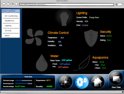
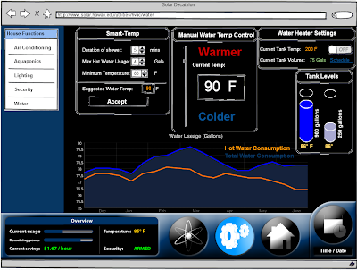
For the past week my group has been working to revamp our mockup and finish implementing some missing functionalities. It's been tough to come up with new material, as it seems that we've explored most every option. At the same time, anything that we do come up with has to endure a barrage of design-oriented questions: Is it simple? functional? isn't that similar to x,y, and z? are you sure we can actually implement that?
Don't show the user any data they can't respond to.
This statement alone culled out about 60% of the ideas we were able to brainstorm out over the past two weeks. It's difficult to rationalize not presenting the user with relevant data simply because they can't act on it. Case in point: the newspaper. While users won't do much about a wild fire killing thousands of dingo-babies every hour, it's still interesting to read about. If someone offered me a way to monitor Internet traffic levels over time, why wouldn't I be interested? Despite my inability to affect the data in any significant way, it's still cool to have. Anyway, this restricted us to visualizing only the data that users can respond to (which isn't much in a house that takes care of its self.
 Our "Design Process" consisted of a chat or two over Ventrilo, numerous in person talks, phone calls and Instant Messages. Because we all know each other, we keep in contact almost daily, so all it took to breach the subject was "So... about the house...". Initially we sat down for about two hours and figured out the key systems that we wanted to implement, and then we dived up the work. There was a fairly constant back and forth flow of proposing new ideas and asking for feedback. Our resident artist thew together a template for all of our pages that contained main menu links embedded in a great-looking frame. After that we went our separate ways and produced a pretty neat site if i do say so myself.
  We tried to keep the main pages simple, where users were shown some nice pictures with colorful text and links that took them to more detailed pages. We also tried to translate our metrics into something more relevant for the user. One of the best ideas (which we took from another group) was to use money as a way of expressing energy/water use. We also tried to include "wizards" or "smart features" wherever we could. These would allow users to set a budget for energy use (in dollar terms), and then the wizards would tell the user how long they can run the A/C or how hot their showers can be and still remain within budget. This allows users to interact with the system and overtime, get a feel for how much money (and therefore energy) a hot shower or an hour of air conditioning uses up.
 Our group felt a little limited by the Mockups program, as its sketchy lines and jagged edges took away from the sleek and elegant design we were going for. In the end, there was a great deal of photoshoppery that was done, and a lot of our design elements were imported as image overlays.
No comments:
Post a Comment