Tuesday, April 24, 2012

The Grid

As the semester draws to an end, so too does this project.  PM gave us notice that this would be the last week we work on our sites.  I'm a little sad to see it be over, there have been some really neat ideas, awesome designs, and creative solutions.  It was fun to see what everyone else was doing from week to week.  Plus, have multiple people working on the same problem made the project a whole lot less stressful.  It took away a lot of the burden and mediocrity of what otherwise would have been a belly flop into a sea of endless divs . 

My goals for the last week were to finish cleaning up the site (the energy, prizes, & activities pages).  I also wanted to integrate Elton's Epic Grid.  I'll simply point to Elton's blog, and leave it up to the reader to educate themselves.  Elton's Grid is pretty slick.  At the last meeting, Elton pulls out his phone, brings up his Grid, and the group is wowed.  He pulled it off.  He made a hulking 9X12 interactive grid fit on a mobile screen. 

So of course I had to beat him... of course.  But the fact is, I can't.  Elton did a bang up job, the only small thing I could add was to fix a small issue where the title boxes for each row overflowed.  I did so by rotating the titles sideways, and elongating the divs.  The result is that the gird fits nicely on a 290px wide screen, which is just about any phone screen in portrait mode. 

Desktop View
Mobile view


Tuesday, April 17, 2012

Back to Square One

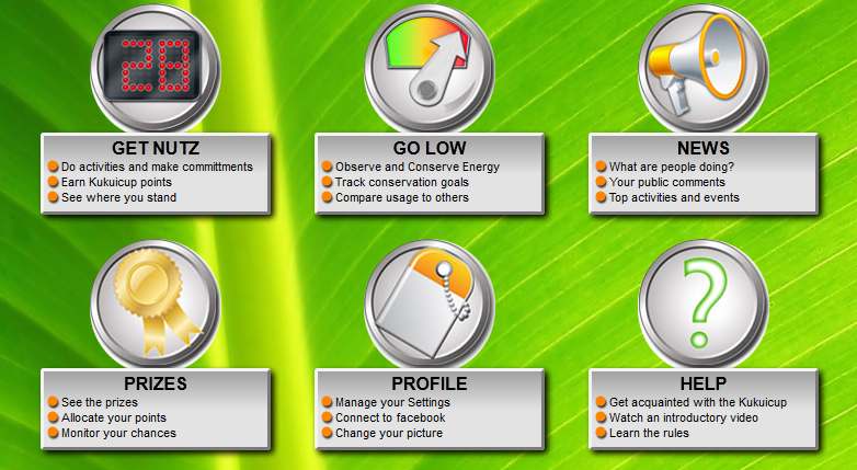
So after a pair of meetings on Friday, the PM lays out the following requirements for the Homepage:
1.  It should be in a list (and wrap freely)
2.  Elements should always be centered.
3.  By default, 3 elements per row.
4.  Flexible enough for 6-8 elements.
5.  It should be responsive.

The list seems simple enough, but in reality, items 1 and 5 are contradictory.

The original homepage had two rows of three elements (there were only 6 elements at the time), which were responsive, but overflowed their rows.  The result was that each row of three elements rendered as two elements pushed to the left, and one lone element wrapped on the next line.

My fix for this was to throw all the elements in a list, so that they wrapped freely, maximizing the number of elements in a row.  But this caused difficulties in centering elements.

The (lame) solution was to simply fix the over-flow problem, and have two rows of responsive elements.  However this looks strange on a very wide monitor, as you have three super long elements in each row.

The ultimate solution would probably to use jQuery or MVC-templating to dynamically determine how many elements to put in each row based on the screen size, and handle margins accordingly.  However, I felt like the PM might view this as "hackish" or too time-consuming, and so avoided it.

The Latest Build

Mobile view
Anyway, back to the meeting.  The PM tells us to ignore the larger screens for the moment, and try to get something that works well at a width of 1050px (his laptop resolution) and lower.  My latest bid goes back to square one: fixing the responsive rows to keep them from overflowing.  I did however integrate the multi-column mobile view from last week. 


A cool trick that I picked up this week was the use CSS selectors

:nth-child({ number expression | odd | even })

and
:nth-of-type({ number expression | odd | even })

I'll direct you here for a more detailed explanation and some nice samples:
http://css-tricks.com/the-difference-between-nth-child-and-nth-of-type/

But essentially they let you (in CSS) select elements of a parent using values and expressions.  Notably, they let you select every other, every third, or every nth element.  In my case, I used them to select the seventh element and give it a margin-left: 20%.  This essentially centers the last row of elements.  Neat right?

Link to the file in question:
http://kukuicup-rui.googlecode.com/svn/trunk/Bloggable/4-17-2012/home.html

and the CSS file:
http://kukuicup-rui.googlecode.com/svn/trunk/Bloggable/4-17-2012/css/home.css

Friday, April 6, 2012

Sometimes the Best kind of Responsiveness is no Responsiveness

After playing around with the HTML, and exploring Twitter Bootstrap's CSS, I've finally found the difference between class="row-fluid" and class="row".  Both containers scale with the page size, but row-fluid will also scale the components within that fluid row.  A plain row will keep the items a static size, and wrap them when there's not enough room.  After this week, I can appreciate having both options. 
  When doing my news page, I had the choice of either letting my elements flow and wrap as the page re-sized by using rows or making them stay put simply scale using row-fluid.  I would have opted for the standard row, but there's still a little bit of glitchyness caused by the overrides to the Bootstrap codebase made by senior developers.  So I ended up going with the fluid rows to keep things from hopping around excessively.


  Speaking of trouble with jumping elements, I had an issue in my homepage.  The homepage normally features several large icons-links with accompanying text.  Originally these icons were centered above the text, but I felt that this took up too much room, and so pushed the images inline with the text, and pushed them over a static number of pixels. 


This caused chaos when the divs were re-sized, images and text boxes went flying ever which way.  To rectify this, I had to make sure that the divs stayed a static width.  This effectively meant I couldn't use Bootstrap's built in responsiveness (but that didn't prevent me from trying for several hours).  Anyway, after a hard-fought but pointless battle, I realized I had a simmiliar issue weeks before.  The news page features a widget called "Lounge Members" which is made up of a div containing imagelinks that don't scale, and arrange themselves to fit within a scaling div.  Bingo.  After looking through the source, it turned out that the widget was an unordered-list (<ul>), with each imagelink being a list item (<li>).  To fix my homepage, I did the following:
<div class="dynamicallyResizingDiv">
    <ul>
          <li>
              <imageicon goes here>
          </li>
         <li>
              <imageicon goes here>
         </li>
        ....
   </ul>
</div>
 Of course I messed around with the margins on the li elements to make things look pretty.  And now that's sorted.


links:
news page: http://kukuicup-rui.googlecode.com/svn/trunk/Bloggable/news.html
home page: http://kukuicup-rui.googlecode.com/svn/trunk/Bloggable/home.html

Friday, March 23, 2012

BootStrap Take-2

So after playing around with bootstrap for the past week, I've come to the conclusion that it's pretty smart.  I mentioned last week a potential problem regarding the arrangement of divs of varying heights.  Well, it was a non-problem, I just threw the divs in question into another div and gave that div a span6 class (which makes that div dynamic).  I also gave a row three span6 divs (the sum of spans in a row should not exceed 12), and it handled them nicely, aligning two on the same row, and throwing the third to the next row, left justified.  The biggest challenge in this project is that the senior development team overwrote the auto-sizing/dynamic placements with media queries so that the navbar and infobar (the two strange looking bars) would span the entire width of the page.  This means that I have to handle my own margins, and that some of the custom-defined scaling parameters cause bad/awkward placements at some browser widths.  I've been trying to deal with these oddities on a case-by-case basis, but I've ended up writing a long series of media queries for very small,specific ranges of width.  Not very dynamic at all.  I think the solution in this case is to ditch the screen-spanning nav and info bars (plus the overridden CSS), and maybe use a hero-unit (one of BootStrap's features) instead. 

"A difference that makes no difference is no difference".
At the last meeting, I had a discussion about using rows vs fluid rows (class="row-fluid") .  It was advised that I use fluid rows, but from what I've seen so far, the difference is negligible.   This might stem from the fact that some of the CSS was overridden. It may end up being of some significance down the line, but I'll deal with it when I get there.  In the mean time, I can't complain about the performance of standard rows.

LESS is GREAT!
Last entry, I griped about how it had to be compiled, but honestly, it isn't that bad.  But after getting to play around with it, I found that "LESS-ifying" my CSS files was a simple matter.

<link rel="stylesheet/less" type="text/css" href="your-theme.less">
<script src="less-1.3.0.min.js" type="text/javascript"></script>

The above snippet is all that's needed to "compile on the fly".  Essentially there's a .js file that compiles the .less file on demand.  Pretty nifty.  My biggest fear was having to compile a LESS file every time I made changes, but this approach is just wonderful :).  For performance, once the LESS file is perfected, it can be compiled to a straight CSS file for faster page loads.
 
Here's the link to the .js file: http://lesscss.googlecode.com/files/less-1.3.0.min.js

Friday, March 16, 2012

Twitter Bootstrap & Dynamic CSS

BootStrap
This past week I took a look at BootStrap, Twitter's New(ish) RUI Framework.  Overall, I'm fairly satisfied with what I see.  Bootstraps similar enough to other RUI frameworks (like Skeleton, SimpleGrid, etc.) that it's easy to get into if you have prior experience, but offers a bunny-hill of a learning curve even if you haven't.  Being grid-based, it offers the usual flexibility of defining dimensions based on columns (the responsive grid offers 12 columns in a 960-pixel page), or fractions (one-third, one-fourth, etc).  It also offers basic alignment and in-lining class definitions, but nothing really special. 

 Aesthetically, BootStrap's default theme is very clean, with a color pallete of white, soft-greys, and bright blue accents.  This makes it great for quick mockups that still look professional.  Of course, these can all be overridden, and when combined with BootStrap's compliment of well-drawn icons, makes for a nice "grab-n-go" package.

Where BootStrap really comes into it's own is in it's Responsive package.  The elements scale very nicely, down to a certain point before jumping into a mobile-friendly, wikipedia-style format.  I also appreciate how navigation links collapse into a drop-down menu for easy access that doesn't take up a lot of screen space. 

The PM linked our group a nice little tutorial:
http://webdesign.tutsplus.com/series/twitter-bootstrap-101/

With respect to the Kukuicup site, it seems like moving to BootStrap would be fairly straight forward.  (Note I didn't say easy)  I'm thinking that the "widgets" can be migrated into the gird fairly easily.  The only obstacle I can foresee is that the widgets are different heights, and BootStrap probably wants divs to be the same height.  This might cause issues where the left side of a page is one long widget, but the right side has two shorter ones.  This might be overcome by using negative spacing to "stack" the two shorter divs on top of each-other.


LESS (and it's peers, SASS & CoffeScript)
The PM also raised concerns over the high-levels of repetition within the Kukuicup CSS files, and suggested LESS as a solution.  LESS is a Dynamic CSS language that lets you create methods and variables for CSS files.  For example, one could define a variable
@primarycolor: #FFF; 
and reference primarycolor anywhere in the CSS.  Additionally, LESS allows users to apply classes to other classes by adding the .class notation into another class definition.  For example, I define .shadow to have a drop shadow, I can add that shadow effect to a .box class by
.box {
      .shadow
}

Finally, LESS supports paramaterized methods, for example, letting you dump
     //radius defaults to 5px
.rounded-corners (@radius: 5px) {
      border-radius: @radius; 
}

#header {
      .rounded-corners(10px);
}

The downside to all this is that it requires compiling.  In a world where scripting languages run the web, this seems a bit odd. 


Friday, February 24, 2012

Kukuicup Design - pt III

This past weekend, the PM responded to my submission, and that both have "potential".  Additionally, he posted a laundry list of improvements to make to all of our sites.  The most notable item was that none of us had really touched the info, nav, and quest-bars.  I had been under the assumption that we weren't supposed to touch these.  Moreover, I had actively chosen to leave the quest-bar in theme-2 black. 

In our last meeting, the PM elaborated on his list of grievances, and noted discontinuities in shadows, rounded/square corners, and color palettes for the aforementioned bars.  So I spent this past week trying to revamp these elements.  Initially I tried using an image manipulation program to modify the existing images, but found it EXTREMELY difficult to get the radial widths (despite knowing their values) of my rounded corners to match with those generated by the webpage's CSS.  After a while I realized this approach was a dead-end and ditched it.  My next (and only other obvious) avenue of attack was by manipulating the images/divs with HTML/CSS.  As it turns out, this works really well. 

I ditched the actual image, instead compressing the containing div, and using a combination of padding and margins to keep things in their proper place.  In the illustration, the blue area is the actual div that contains the area highlighted in yellow.  Naurally, shrinking a div of this size down creates layout problems.  I was able to overcome this by adding a small top margin and a giant bottom margin (margins are shown as the yellow area).  This keeps elements in their proper place, while allowing me to use the encompassing div as a useful background for my nav and info bars.  The rationale behind this whole song and dance is  that I can't actually mess around with the html files, as they have to be the same for every theme.  So I had to use CSS to mess around with existing divs.

I also found that I was able to make transparent gradients using the rgba() method.  For example:
    background-image: -moz-linear-gradient(100% 30% 90deg, rgba(239, 214, 120,.67), rgba(255, 255, 255,.67));
    background-image: -webkit-gradient(linear, 0% 0%, 0% 50%, from rgba(255, 255, 255,.67), to rgba(239, 214, 120,.67));
the above two lines normally define a gradient, but by using the rgba method, I was able to set an alpha transparency, and make them transparent.  Neat trick.  The only caveat is that you have to convert color codes from Hex to Decimal.

I present, the finished product:

Friday, February 17, 2012

Kukuicup Design - pt II

So last week's meeting went pretty much as expected - the PM tells me my theme is "too gloomy" and reminds him of vampires.  Additionally, the PM agreed that there was "too much stuff" in the theme.css file, and instructed the groups to make a separate "style.css" file to contain all the non-theme related items (e.g. items needed to override/negate previously defined elements).  A discussion took place about not meeting as often.  The PM said he didn't like the idea and felt that frequent meetings (and thereby feedback) were important to the rapid prototyping methodology.  Interestingly enough, all our meetings this week were cancelled. 

I spent this week pulling extraneous elements out of theme.css and migrating them into style.css.  To the top of my theme.css file I added:
@import url('style.css');

I later discovered that issues arose when I sometimes removed elements from theme.css which were not defined by syle.css.  This resulted in certain elements having their settings defaulted to whatever was defined by the original kukuicup theme.  To resolve the issue, I essentially copied whatever css items were necessary to make the page (including both theme and style elements) into style.css, and then re-defined the same item in theme.css.  This lets theme.css have first-priority over what an element looks like, but if I accidentally (or lazily) fail to define a property of an element, style.css will still render it.  This occurs because I have the above nifty little import statement at the top of my theme.css page.

Another issue was that sometimes I wanted to change what was in the style.css file, but style.css was used by more than just one theme.  This made making style changes nearly impossible.  The answer was to have a separate style.css file for each theme.  While this is sub-optimal, it gives me the greatest flexibility over design options.

Anyway, to break up this giant wall of text, I'll show off a couple of the themes that I worked on this week.

"Theme-2"
Aiming for a "less gloomy", vampire-free theme.


"Theme-4"
We later got an email from the PM instructing us to createa "clean" white-based theme


If you're wondering what happened to "theme-3", trust me, your better off not knowing...